My Projects
As an entry-level marketing and graphic designer, my portfolio showcases a mix of designs and marketing projects. It highlights my exceptional storytelling through visual design, strong understanding of consumer behavior and market trends, ability to create cohesive branding across multiple platforms, proficiency in Adobe Creative Suite and other design tools, as well as experience with both digital and print design projects. This combination of skills sets me apart in the industry.
In this page you will see remnants of my web design experience, social media experience, and graphic design works.
Web Design Projects
Currently working with McClure Creative. Working on the website sgf-sa.net as an ongoing project. I've completed the first two pages and am now focused on building out the menu. Next up, I’ll be diving into the remaining pages to bring the site to life and ensure it’s functional and engaging.

Clay McClure Portfolio
Role: Web Designer
claymcclure.com
Fall 24 Schreiner University project, I was part of a group for an intro web design class, where I collaborated with other students to create a portfolio website for "claymcclure.com." I took the lead on designing the homepage, the graphic design page, and the "Who is the Clay?" page, blending creativity and functionality to showcase the site’s unique offerings.

Social Media Management Experience
Savy Rays Boutique (@savyraysboutique)
June 2024 – November 2024
I served as a marketing assistant managing multi-platform social media content, creating and analyzing posts while monitoring trends, and collaborating with models to produce professional product photography that drove sales.
Schreiner University Shotgun Team (@sushootingteam)
December 2021 – November 2023
As social media manager for the team, I created diverse content across Facebook and Instagram platforms, strategically improving audience engagement while maintaining a strong brand presence that fostered community support and recognition.


This Is Sarah Shots (@this_is_sarah_shots)
October 2019 – April 2022
I developed a photography-focused Instagram account that reached 700+ followers with just 62 posts, averaging 100+ likes per post, and leveraged this engaged audience to secure university visibility, sponsorships, and grants.
Unveiling Lies
(@unveilinglies)
August 2019 – August 2021
I managed Instagram Stories with engaging content that boosted audience interaction, implemented strategic posting that grew followers by 25%, and maintained brand consistency through storytelling and real-time engagement.

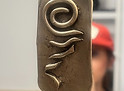
Project 1: Texas Tornado Creative
Working with TTC as a Marketing Assistant, she asked me to create a logo for her and her brand, paired with some mock Instagram campaign


Inspiration Context:
-
Country Western Inspiration: Inspired by self-taken country-style photos that reflect a rugged, adventurous spirit.
-
Cowboy & Tornado Concept: A logo idea featuring a cowboy wrangling a tornado in the desert, symbolizing the fusion of creativity and control.
-
Tornado Bolo Tie: Her favorite bolo tie, shaped like a tornado, influenced the design, adding a personal and authentic Western touch.
The Result

%20(1).png)
%20(1).jpg)
%20(1).jpg)
Result Context:
The Texas Tornado Creative logo combines bold typography with a dynamic tornado graphic to represent energy, movement, and creativity. The swirling tornado conveys innovation, while the mix of serif and script fonts balances professionalism with artistic flair. Additionally, a simplified branding symbol features “T/C” with a tornado-inspired shape and a horizontal line connecting the letters, symbolizing unity and flow. This alternate mark provides a sleek, recognizable identity for versatile branding applications.
Project 2: Sun City Distillery
Schreiner University project for Branding Solutions Design class—our task was to create a new logo for a business with full creative freedom. I chose Sun City Distillery in El Paso.

Inspiration Context:
-
The sunset element represents not only the city's iconic sunrises and sunsets but also the warm, welcoming atmosphere of El Paso.
-
The headdress design draws from the rich Native American heritage in the region, particularly reflecting the cultural significance of local tribes.
-
The mountains symbolize the beautiful desert landscape surrounding El Paso, giving the logo a grounded and unique feel that connects to the local geography.
-
The pattern based on the headdress enhances the authenticity of the design, incorporating elements that evoke tradition and craftsmanship.
-
By blending these local symbols, the logo aims to create a memorable, modern brand identity that stands out and resonates with both locals and visitors.
The Process
The sketches included drawings representing mountains, headdresses, sunsets, native patterns, and reflective shadows.
.jpg)
.jpg)
.jpg)
The Result

Result Context:
The final logo for Sun City Distillery combines a sunset, mountains, and a headdress-inspired pattern to reflect El Paso’s identity. he design reflects El Paso’s identity, blending its 'Sun City' nickname, Native American heritage, and desert landscape into a bold, memorable brand. The result is a modern yet culturally rich logo that enhances the distillery’s identity and market presence.
Project 3: Substance
Schreiner University project for Branding Solutions Design class—our task was to create a new logo for a business with full creative freedom. I chose Sun City Distillery in El Paso.


Inspiration Context:
-
Our concept transforms typically unhealthy products—alcohol, vapes, and Tabacco—into genuinely beneficial alternatives while keeping their appeal.
-
We aimed to sell in low-income stores like Walmart and gas stations, where these products are most commonly bought, making wellness more accessible.
-
By offering healthier options in everyday retail spaces, we bridge the gap between convenience and well-being without requiring expensive specialty stores.
-
Inspired by vintage apothecaries, Western motifs, and the allure of mysterious elixirs, we designed a brand that feels both nostalgic and intriguing.
-
The project allowed us to explore typography, packaging, and branding elements that reflect an authentic yet satirical take on classic wellness products.
The Process


Our sketches included detailed herb drawings representing product ingredients, a steamboat for a fun, funky twist, various logo options for each product, and a mock-up of a small cloud for an advertisement video.

.png)

The Result


.jpg)


Final Result Website here:
Project 4: Caltrans Division 11
Schreiner University project for Branding Solutions Design class—our task was to create a new logo for a business with full creative freedom. I chose Sun City Distillery in El Paso.

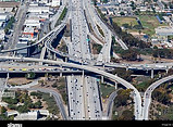
.jpg)
Inspiration Context:
-
The sunset element represents not only the city's iconic sunrises and sunsets but also the warm, welcoming atmosphere of El Paso.
-
The headdress design draws from the rich Native American heritage in the region, particularly reflecting the cultural significance of local tribes.
-
The mountains symbolize the beautiful desert landscape surrounding El Paso, giving the logo a grounded and unique feel that connects to the local geography.
-
The pattern based on the headdress enhances the authenticity of the design, incorporating elements that evoke tradition and craftsmanship.
-
By blending these local symbols, the logo aims to create a memorable, modern brand identity that stands out and resonates with both locals and visitors.
The Process


Result Context:
The Texas Tornado Creative logo combines bold typography with a dynamic tornado graphic to represent energy, movement, and creativity. The swirling tornado conveys innovation, while the mix of serif and script fonts balances professionalism with artistic flair. Additionally, a simplified branding symbol features “T/C” with a tornado-inspired shape and a horizontal line connecting the letters, symbolizing unity and flow. This alternate mark provides a sleek, recognizable identity for versatile branding applications.
The Result

Result Context:
The final logo for Sun City Distillery combines a sunset, mountains, and a headdress-inspired pattern to reflect El Paso’s identity. he design reflects El Paso’s identity, blending its 'Sun City' nickname, Native American heritage, and desert landscape into a bold, memorable brand. The result is a modern yet culturally rich logo that enhances the distillery’s identity and market presence.